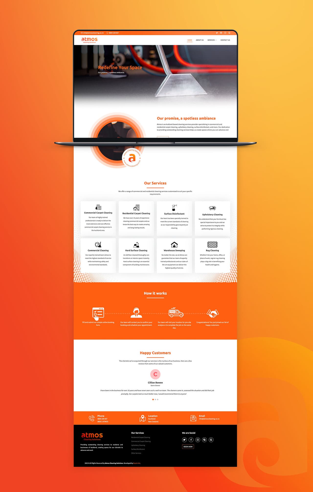
Project Brief :
Atmos is a cleaning and air conditioning solutions provider in Auckland, New Zealand. They have been operating in Auckland for over 7 years under the hood and finally decided to give them a good branding and come to the real competition in the market. Their mission is to provide outstanding services to residents and businesses in Auckland, creating spaces for their clientele to advance and excel. The owner wanted their brand to represent the New Zealand identity and be more appealing to the local audience. He was also looking for something unique and minimal in design.
My Approach :
At first the owner didn’t have a clear direction for the brand identity, through a few focused questions about his business, I was able to uncover the key insights I needed to shape the brand’s foundation. During our first meeting, Owner suggested using orange colour for the logo, a bold and unique choice for a cleaning company. I loved the idea as It immediately stood out as fresh, confident, and distinctive, not just within New Zealand but even on a global scale.
After the discovery session, I began my research and started sketching ideas to explore different creative directions. I wanted the visuals to feel strong, memorable, and true to the brand’s character. A few days later, I presented three initial logo concepts. The owner connected with one in particular, and after some refines and tweaks I have completed the final logo for the Atmos brand which reflects their unique identity among New Zealand businesses.
What Client Say :
" Coming soon..."
Share Now :