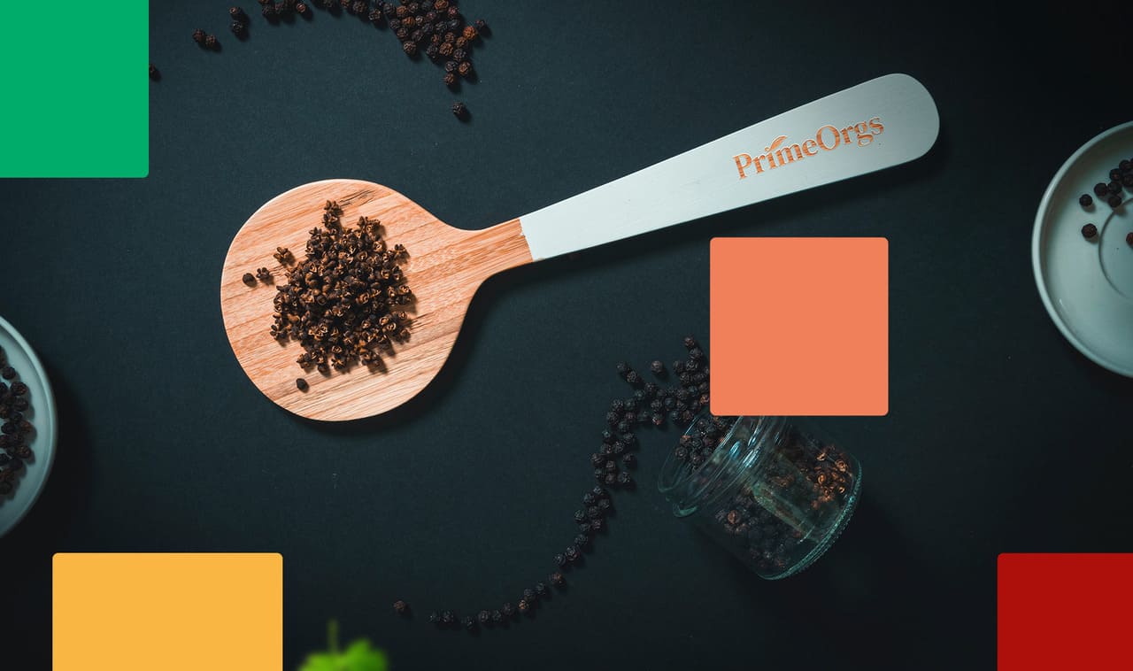
Project Brief :
PrimeOrgs is a registered brand and a property of Primorgs private limited company in Sri Lanka. PrimeOrgs are an integration of growing and harvesting spices under tropical climate with proper care and precision, handling, processing and packaging with special care to the utmost quality. Premium, eco friendly & natural organic products are the core values of the brand.
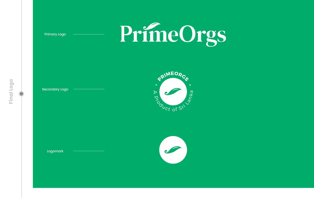
The company wanted to make a brand new logo for the PrimeOrgs brand which can also communicate their core values effectively while being the primary identification of their brand.
My Approach :
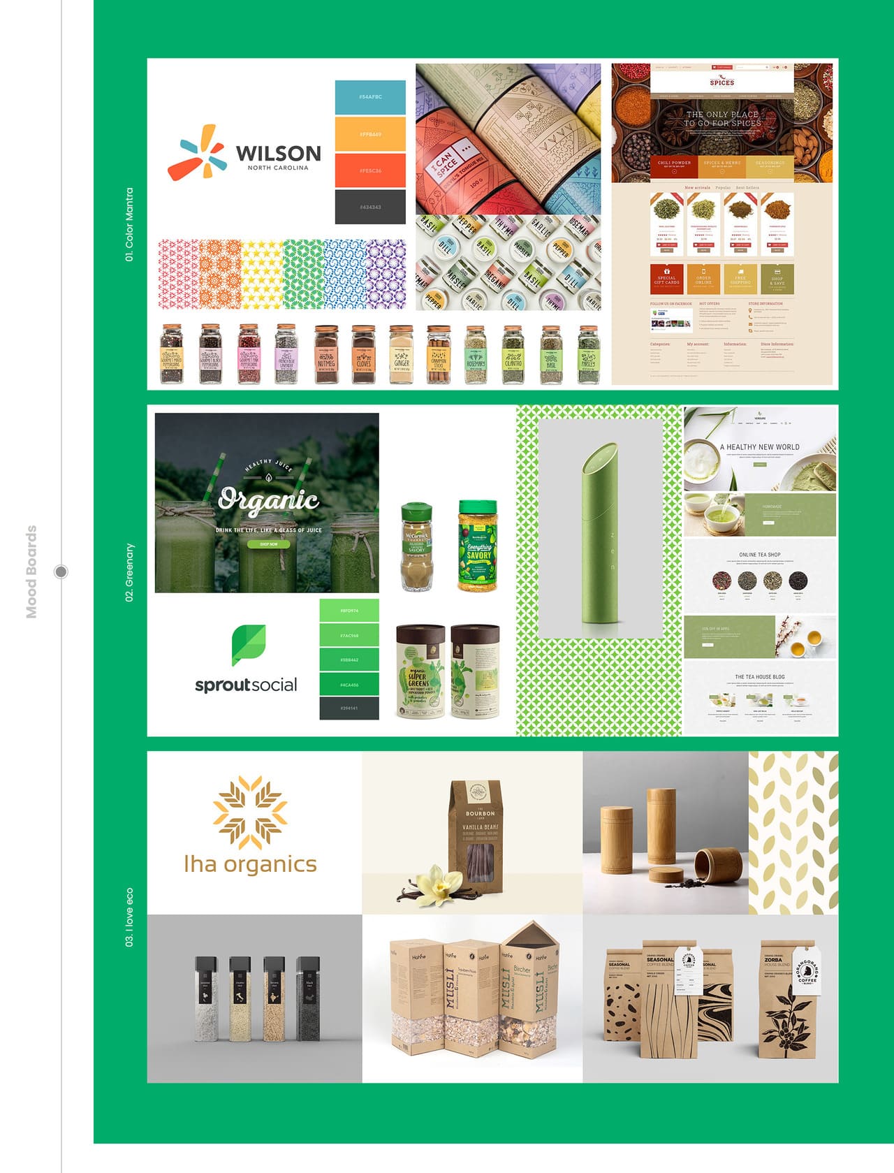
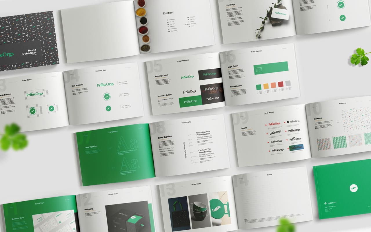
After the initial discovery session with the two managing directors, we agreed the logo should be clean, easy to read, and memorable. To guide the direction, I researched the brand and created three mood boards to help them see the possibilities visually and make sure we were aligned in the design process.
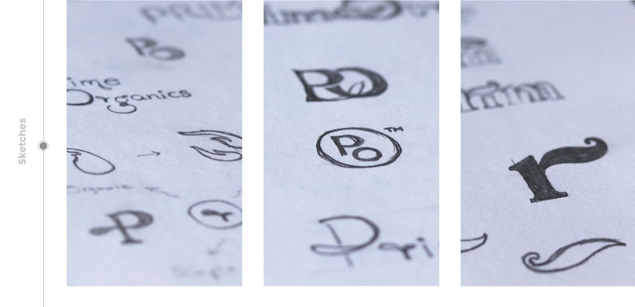
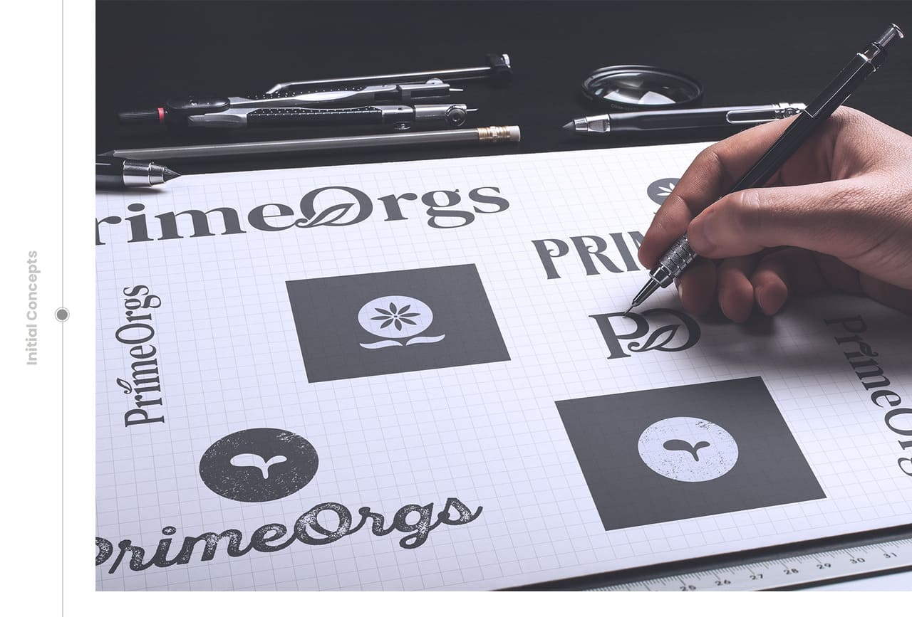
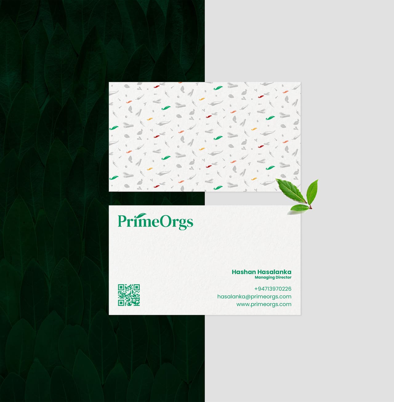
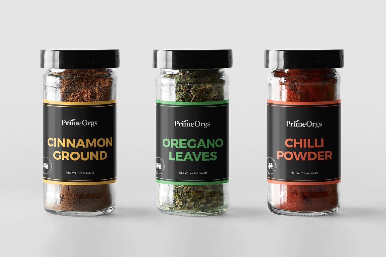
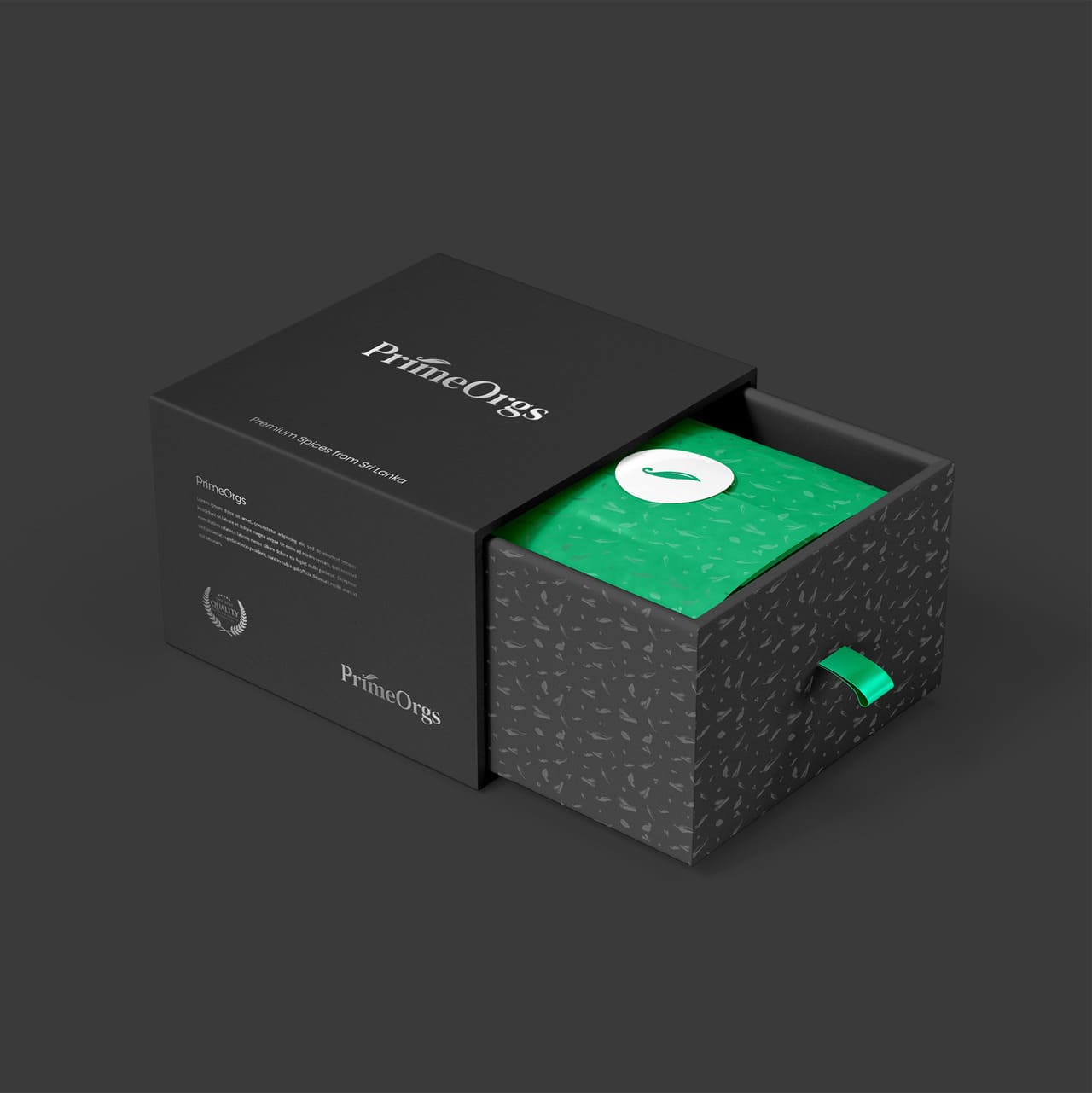
At first, they leaned toward the Greenery mood board, but after I explained the benefits of introducing more colors, we decided to combine elements from both the Greenery and Color Mantra boards to shape their brand look. With that direction clear, I designed three initial logo concepts. They connected with one in particular and gave me a few small suggestions. After refining and making adjustments, I was abled to finalised the logo for PrimeOrgs, capturing the premium, eco-friendly nature of their organic products.
What Client Say :
" The project is completed nicely and perfectly. We have had several meetings to discuss the adjustments we needed and all the requirements are met and we are extremely satisfied with that. As a final word, have to say that this work is worth the money."
Share Now :